En esta sección exploraremos la anatomía de las figuras en Matplotlib, un conocimiento fundamental para cualquier persona que se dedique a la visualización de datos. Descubriremos los componentes básicos de una figura para construir visualizaciones claras y efectivas.
Conocer la anatomía de una figura en Matplotlib es como aprender la gramática antes de escribir una novela; es el primer paso para dominar el arte de la visualización de datos. Desde los ‘Axes’ hasta los ‘Ticks’, cada parte de una figura desempeña un papel crucial en la creación y personalización de gráficos que se ajusten a nuestras necesidades específicas de análisis y formato.
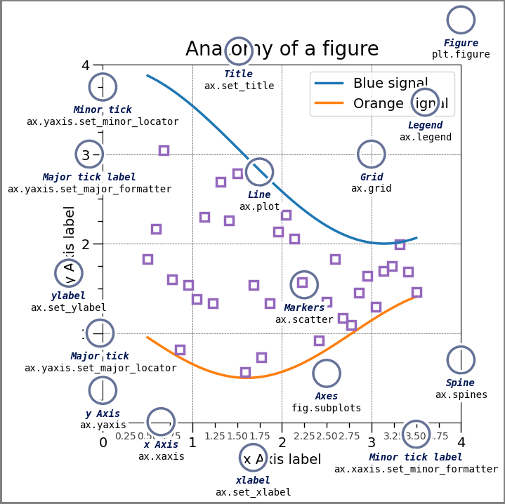
import matplotlib.pyplot as pltimport numpy as npfrom matplotlib.patches import Circlefrom matplotlib.patheffects import withStrokefrom matplotlib.ticker import AutoMinorLocator, MultipleLocatorroyal_blue = [0, 20/256, 82/256]# make the figurenp.random.seed(19680801)X = np.linspace(0.5, 3.5, 100)Y1 =3+np.cos(X)Y2 =1+np.cos(1+X/0.75)/2Y3 = np.random.uniform(Y1, Y2, len(X))fig = plt.figure(figsize=(7.5, 7.5))ax = fig.add_axes([0.2, 0.17, 0.68, 0.7], aspect=1)ax.xaxis.set_major_locator(MultipleLocator(1.000))ax.xaxis.set_minor_locator(AutoMinorLocator(4))ax.yaxis.set_major_locator(MultipleLocator(1.000))ax.yaxis.set_minor_locator(AutoMinorLocator(4))ax.xaxis.set_minor_formatter("{x:.2f}")ax.set_xlim(0, 4)ax.set_ylim(0, 4)ax.tick_params(which='major', width=1.0, length=10, labelsize=14)ax.tick_params(which='minor', width=1.0, length=5, labelsize=10, labelcolor='0.25')ax.grid(linestyle="--", linewidth=0.5, color='.25', zorder=-10)ax.plot(X, Y1, c='C0', lw=2.5, label="Blue signal", zorder=10)ax.plot(X, Y2, c='C1', lw=2.5, label="Orange signal")ax.plot(X[::3], Y3[::3], linewidth=0, markersize=9, marker='s', markerfacecolor='none', markeredgecolor='C4', markeredgewidth=2.5)ax.set_title("Anatomy of a figure", fontsize=20, verticalalignment='bottom')ax.set_xlabel("x Axis label", fontsize=14)ax.set_ylabel("y Axis label", fontsize=14)ax.legend(loc="upper right", fontsize=14)# Annotate the figuredef annotate(x, y, text, code):# Circle marker c = Circle((x, y), radius=0.15, clip_on=False, zorder=10, linewidth=2.5, edgecolor=royal_blue + [0.6], facecolor='none', path_effects=[withStroke(linewidth=7, foreground='white')]) ax.add_artist(c)# use path_effects as a background for the texts# draw the path_effects and the colored text separately so that the# path_effects cannot clip other textsfor path_effects in [[withStroke(linewidth=7, foreground='white')], []]: color ='white'if path_effects else royal_blue ax.text(x, y-0.2, text, zorder=100, ha='center', va='top', weight='bold', color=color, style='italic', fontfamily='monospace', path_effects=path_effects) color ='white'if path_effects else'black' ax.text(x, y-0.33, code, zorder=100, ha='center', va='top', weight='normal', color=color, fontfamily='monospace', fontsize='medium', path_effects=path_effects)annotate(3.5, -0.13, "Minor tick label", "ax.xaxis.set_minor_formatter")annotate(-0.03, 1.0, "Major tick", "ax.yaxis.set_major_locator")annotate(0.00, 3.75, "Minor tick", "ax.yaxis.set_minor_locator")annotate(-0.15, 3.00, "Major tick label", "ax.yaxis.set_major_formatter")annotate(1.68, -0.39, "xlabel", "ax.set_xlabel")annotate(-0.38, 1.67, "ylabel", "ax.set_ylabel")annotate(1.52, 4.15, "Title", "ax.set_title")annotate(1.75, 2.80, "Line", "ax.plot")annotate(2.25, 1.54, "Markers", "ax.scatter")annotate(3.00, 3.00, "Grid", "ax.grid")annotate(3.60, 3.58, "Legend", "ax.legend")annotate(2.5, 0.55, "Axes", "fig.subplots")annotate(4, 4.5, "Figure", "plt.figure")annotate(0.65, 0.01, "x Axis", "ax.xaxis")annotate(0, 0.36, "y Axis", "ax.yaxis")annotate(4.0, 0.7, "Spine", "ax.spines")# frame around figurefig.patch.set(linewidth=4, edgecolor='0.5')plt.show()